Brand Fonts/Typography
UMES has two primary brand typefaces: Merel and Sentinel.
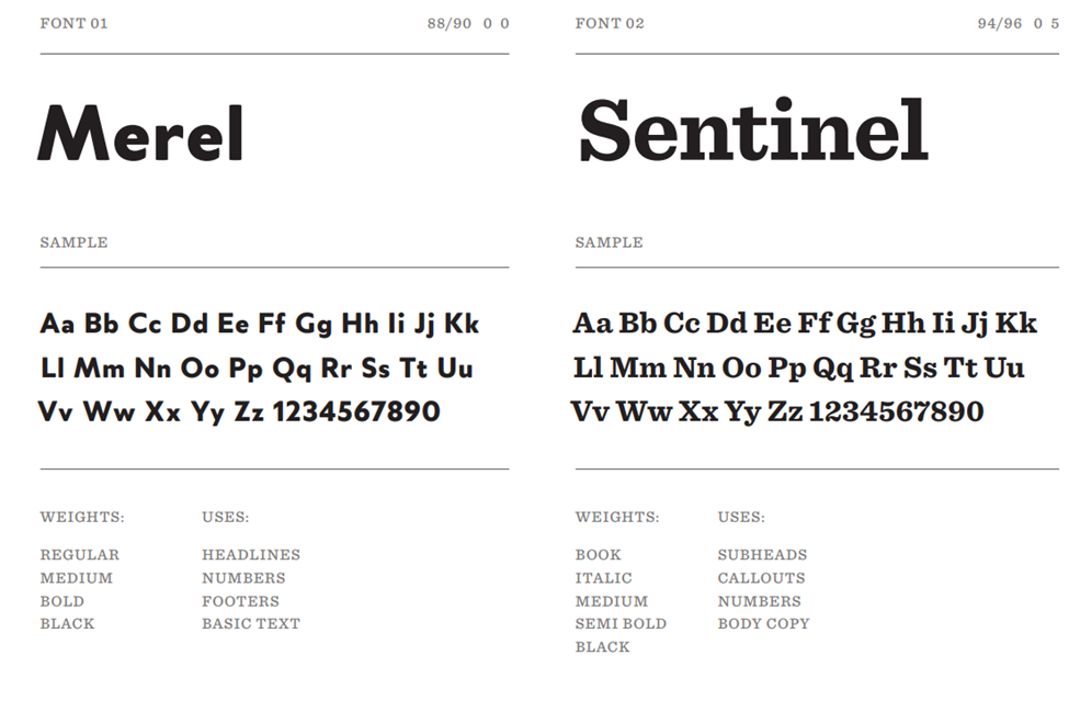
Merel is a modern geometric sans serif font designed to have great legibility at both large and small sizes. Sentinel is a more traditional slab serif font with antique characteristics that brings a sense of heritage to the type kit.
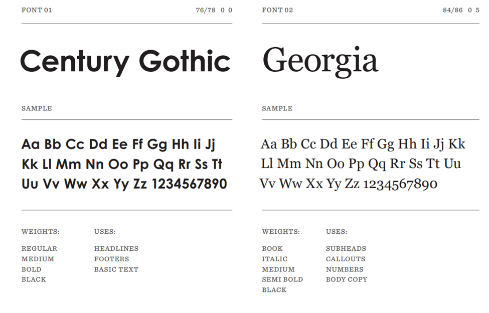
Merel and Sentinel should be used whenever possible. However, if Merel and Sentinel are unavailable due to licensing limits or platform constraints, Century Gothic and Georgia may be used as alternates.
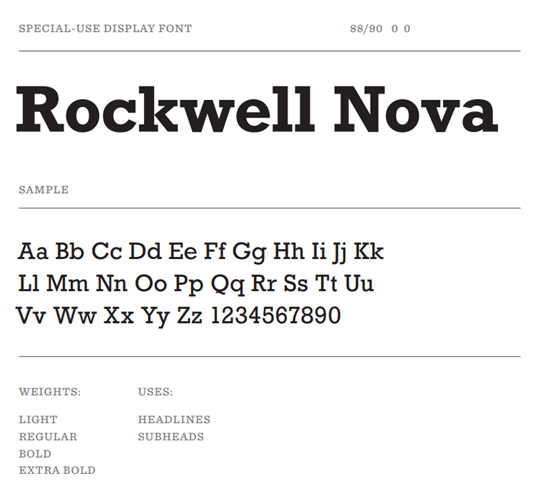
UMES also uses an accent font: Factoria. Factoria should be used strategically and sparingly to create maximum impact, especially in moments that call for energy, school pride, and visual strength. It’s ideal for athletic uniforms, fan gear, spirit wear, promotional campaigns, event materials, and other applications where a blocky, high impact letterform helps elevate the message, preserving the clarity and professionalism of the UMES visual identity. If Factoria is unavailable, Rockwell Nova is the alternate.

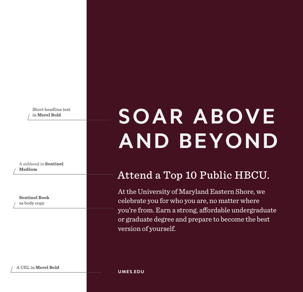
Here, you’ll find examples of how we style UMES brand fonts in action. Merel is used for headlines and can be set in title case or all caps—mirroring the style of our logo. Sentinel is used for subheads and body copy, offering a grounded and cohesive feel across the system. Merel also appears more selectively for callouts, such as URLs. These typographic treatments— from headlines to body text—enhance clarity and reflect our unique identity. Consistent typography helps ensure every piece of communication feels unmistakably UMES.
See the complete Brand Guidelines for additional information on using UMES brand fonts.