
Look! Up in the sky! It’s a bird! It’s a plane! No …, it’s definitely a bird.
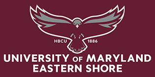
But it’s not just any bird, it’s the newly adopted logo of the University of Maryland Eastern Shore that graces the institution’s water tower.
The recent placement of the new emblem is part of a wide-ranging rebranding effort the university is undertaking. The rollout began July 1.
The new redesign, which was created by Baltimore-based TBC, Inc., features the hawk soaring upward in its trademark maroon and gray.
The impetus behind the design was simple: to establish a singular identity and to laud UMES’s status as a Historically Black College and University, while also distinguishing itself from competitors.
“Since I’ve been here, we’ve had about 12 logos all around the campus and in different formats,” UMES President Heidi M. Anderson said. “…One of the things that always bothered me (was) we are a proud HBCU, and when I go places with that ‘M’ (logo), people didn’t know where I was from.”
As part of the rebranding effort, Anderson had some principles mandated: the university’s colors and mascot must remain the same while adding an increased emphasis on its HBCU legacy.
“We did extensive research before making changes to the logo for the rebrand and the one thing all constituencies felt connected to was the hawk,” UMES Associate Vice President and Director of Marketing & External Relations Alissa Carr, said. “The hawk really resonated with everyone.
“We also discovered many students and prospective students and parents had no idea UMES was an HBCU, so it was important to incorporate that as well as the fact that we have been here since 1886, long before many of our sister (University System of Maryland) universities.”
The complete updating of on-campus signage will take time due to supply chain issues, Anderson said.
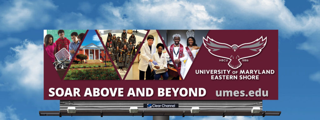
In addition to the updated insignia, a new tagline, ‘Soar Above and Beyond,’ was unveiled.
Anderson said while UMES’s original motto, Facta Non Verba, remains intact, this tagline is something that epitomizes what she observes as she traverses the campus every day.
“To watch a hawk so majestically soar and he goes higher and higher, that’s what we’re doing too,” she said. “(That’s) in everything we do. We’re excelling higher and higher. Higher quality, higher goals, higher enrollment.”
The university expects the rollout to be complete by Homecoming in November.